In album cover design, the temptation is to say too much. The most memorable covers say very little, but mean everything. For a Christmas choral album, the challenge was to capture reverence, stillness, and warmth in a single image without relying on clichés. The cover needed to feel timeless enough to represent the music without dating itself, and personal enough to feel like it belonged to this specific group.
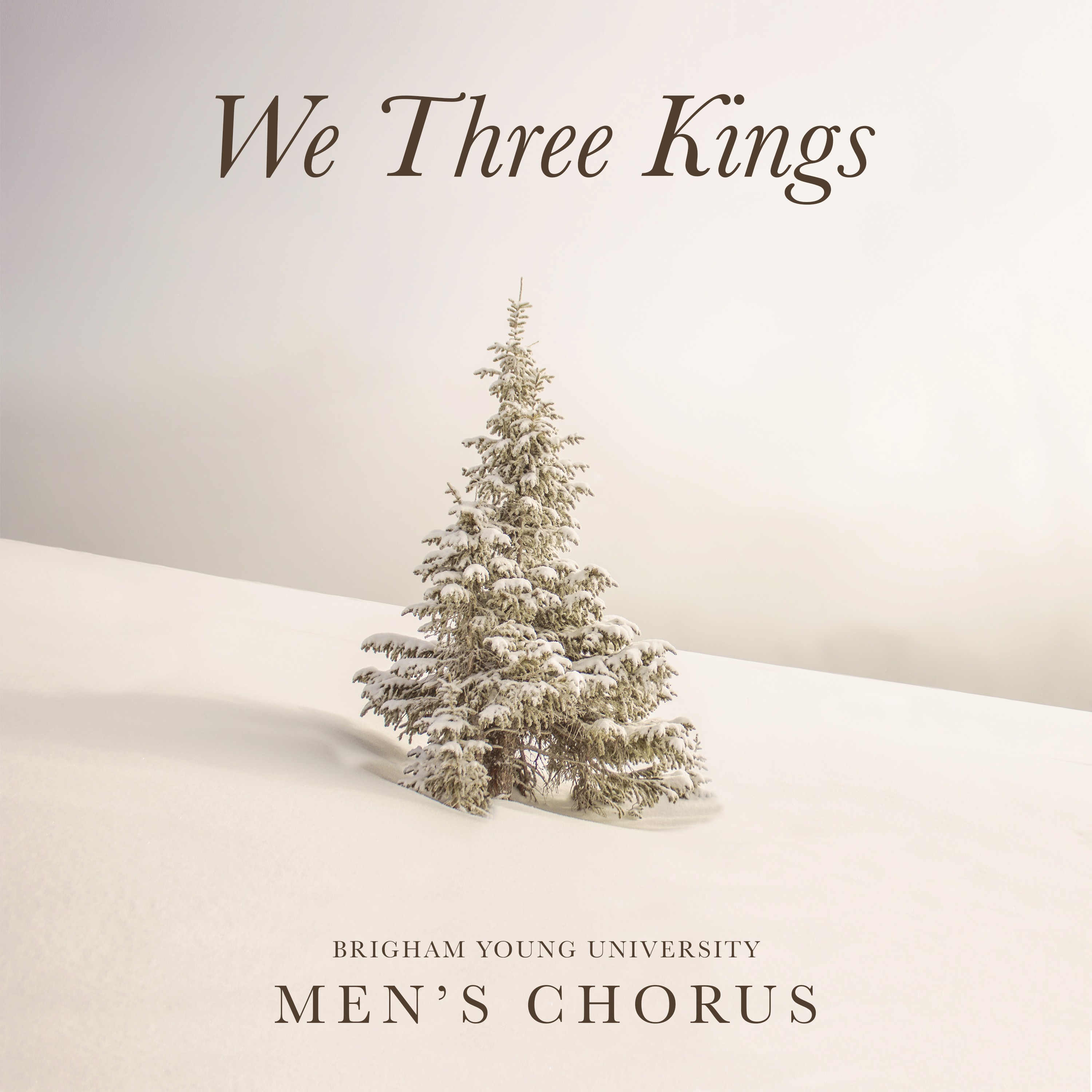
I selected a stock photograph of a lone snow-covered tree that feels understated, quiet, and full of natural symbolism. Rather than using it as-is, I photoshopped the image extensively to clean up distracting elements, refine the tonal balance, and create the soft, almost ethereal quality the concept required. The typography was placed with deliberate simplicity: an elegant serif for the title, small caps for the group name, with generous white space allowing both the image and the words to coexist without competing. Every decision was made in service of one goal: when someone picks this up, they should feel something before they even press play.